Vital Vibes: online magazine

About the project
Vital Vibes is an online health and wellness magazine offering articles, reviews as well as recommendations on food, experiences and wellness. For this project, I worked in a pair with my colleague Ashley to create a hi-fi interactive prototype.
In total this project took us four days to complete.
Our User Persona

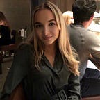
Meet Elaine (35) — The Eco-Friendly Researcher.
She reads National Geographic, The New Yorker and Broadly.
She wants to invest more on self-care and self-love while being good to others, seeding a more empathic society. She likes to read during her work breaks.
She often works at home, when she’s not at university or the library.
Her Goals: be more rational, discover new passions, achieve a good work-life balance.
Competitors
In order to understand what’s already out there in the wellness space, we looked at five websites with similar concepts of lifestyle, health and wellness to see what features they give users, how they present them and to identify any missing gaps in their offerings. We want to see if this would give us an insight that could inform how we stand out and offer something new and fresh.

To differentiate our website from the crowd we came up with the idea of incorporating a booking feature that would allow you to search for activities in your local area that match your wellness and lifestyle goals. We also decided to incorporate reviews so that users can research and compare these activities before booking them.
User Journey
The user flow we created is very simple. We worked on two happy paths that connect at the end. One of which focuses on the optional questionnaire leading the user to book an activity. Whilst the other one focuses on closing the pop up and carrying on to the site and choosing an article to read.

Low fidelity
To get started on our design we began by creating a low fidelity prototype. We did some quick and rough sketches and highlighted parts we liked and eliminated aspects we didn’t think would work or be effective. Once we were happy with our final lo-fi prototype, we tested it with six users and took notes on how they navigated the screens while listening to any suggestions they had for improvements. The main suggestion that we had from the majority of our users is to narrow down the menu bar as they felt overwhelmed with the amount of information on the home page.

Mid fidelity
After implementing these changes, we moved to mid fidelity design where we eliminated all the unnecessary information and focused on three key content areas that we felt would add the most value to the user: food, experiences and wellness. We implemented a pop up that asks whether they would also like to book an activity. At this stage, we also came up with the name and the logo for the site. Since the magazine offers a booking feature, we wanted the name to represent something fun and positive, while also remembering that the articles are mostly health and lifestyle related. We tested our mid-fi with six other users and got additional feedback. We learned that we needed to fix some sizing of the buttons and alignment.


Mood board
We created a mood board to start bringing the brand and idea to life. We looked at warm neutral colours, clean graphics and simple fonts as we felt these would resonate best with our wellness focussed audience. We wanted the website to feel light, peaceful and stress free. The overall impression was a lot of nude and muted colours that create a feeling of calm and serenity.

Final Product
Learnings
This project was great fun to work on. I’m passionate about health and wellness and a trained yoga instructor so it was exciting to be able to create a product that I would love to use. Being aligned with the target audience and having an affinity with the content helped inspire me and I found myself thinking non-stop about how we could create something that had wow factor for users and got them engaged with their health.
My colleague on the project shared my vision from the start. Both of us were still learning at this stage but through teamwork and hard work I think we created something that answers the brief and delivers a site that would have a long dwell time for users.
Some things I would change in the future (if I had more time) are: possibly narrowing down the content even further, sizing down some of the images and alignments, especially in the mobile version and focusing more on the flow of the articles, rather than the new booking feature.
Considering the time we had, I’m proud of what we had achieved and learned.